
AAA
Challenge
How might we improve AAA's user experience by making it clear and more intuitive to use?
Full Process
My Role
UX Design, Research, Interaction Design, Prototyping, Usability Testing, Ideation, Visual Design, and Research.
Year
2020
Timeline
2 Weeks
Tools
Figma, Origami Studio
Team
2 UX Designers
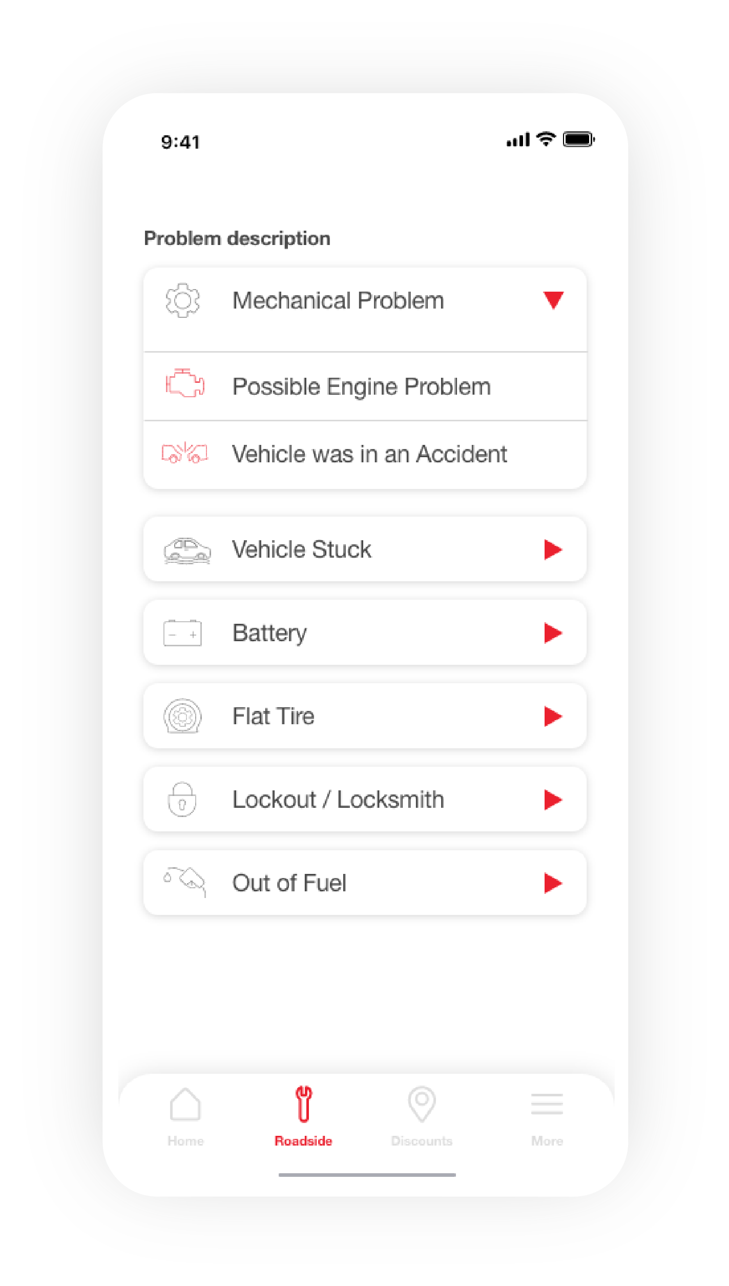
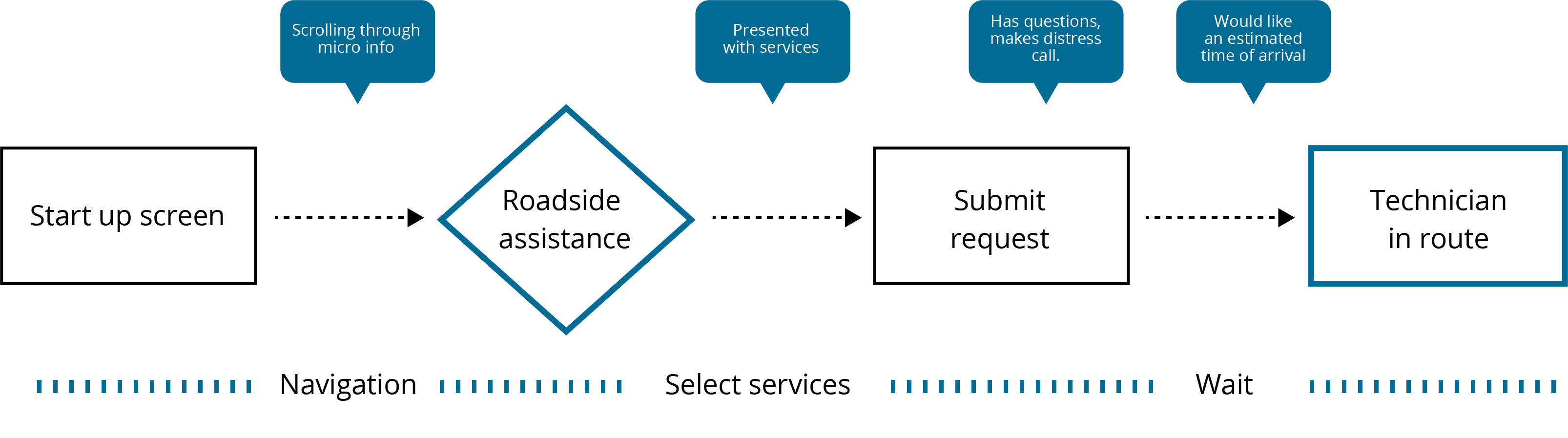
Roadside assist inquiry
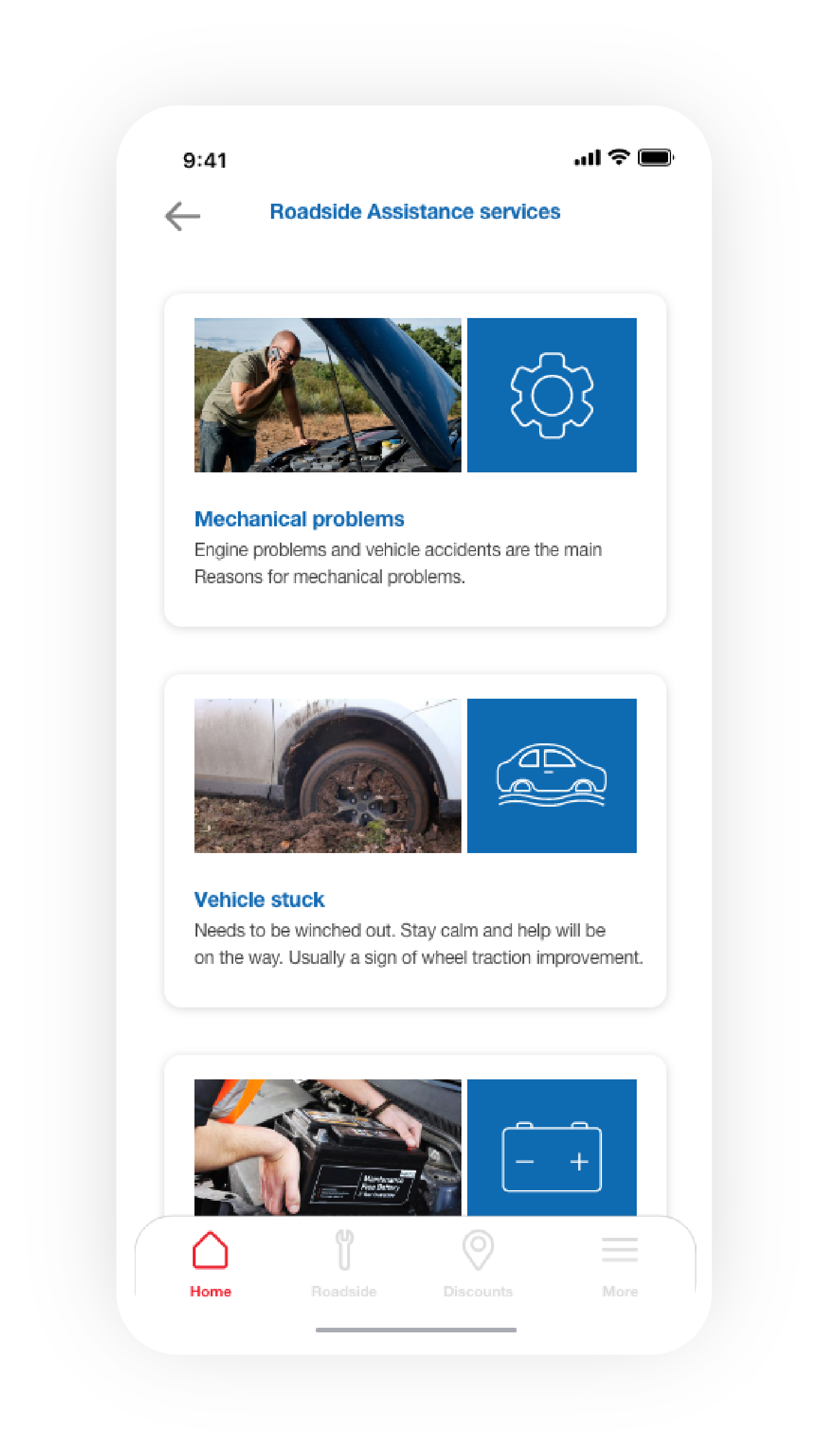
Roadside service detail
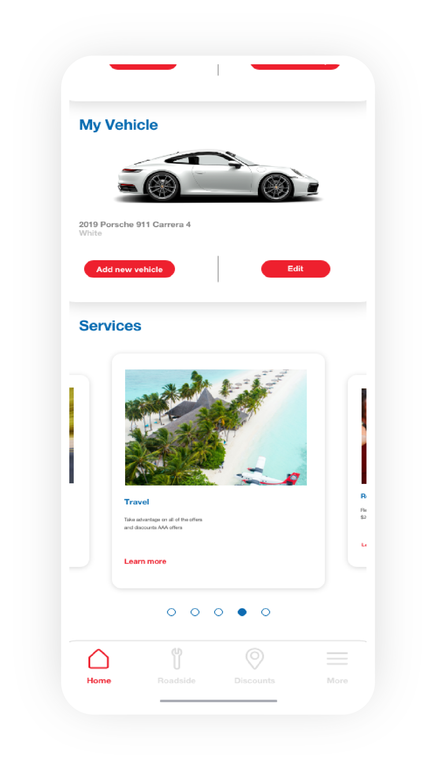
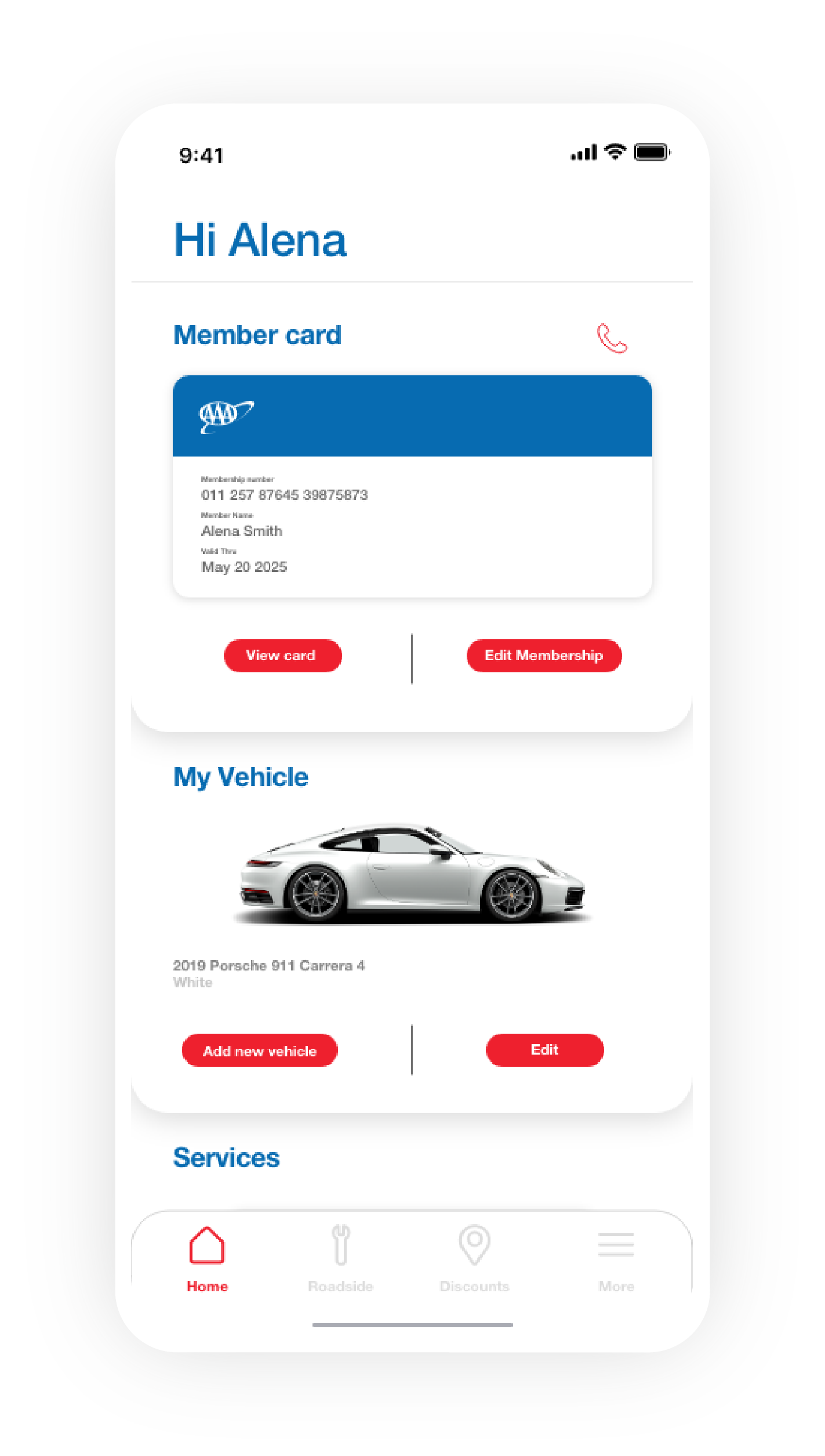
Home screen
Dispatch request
Dispatch chat feature
Destination selection
01
Understand
Context
For this case study, I defined a number of constraints to work within, as well as a project scope. I also outlined goals, non-goals, and edge-cases that I wanted to think about throughout the process.
Problem Definition
Through firsthand observation, and interviews with real AAA users, a clear picture emerged of the rider's pain points. To name just a few:
-
Lacks assurance - long wait times between the dispatch and arrival with a primitive approach to locating and communicating with users. -
Lacks convenience - users are not given full access to the dispatch driver for updates or an estimated time of arrival. -
Unclear hierarchy - it's unclear what should be clicked on with a large amount of content to scan through. -
Services not made prominent - main services are only shown once a user is making a request for roadside assistance.
From the problems identified above, I drew up a problem statement:
How might we improve AAA's user experience by making it clear and more intuitive to use?
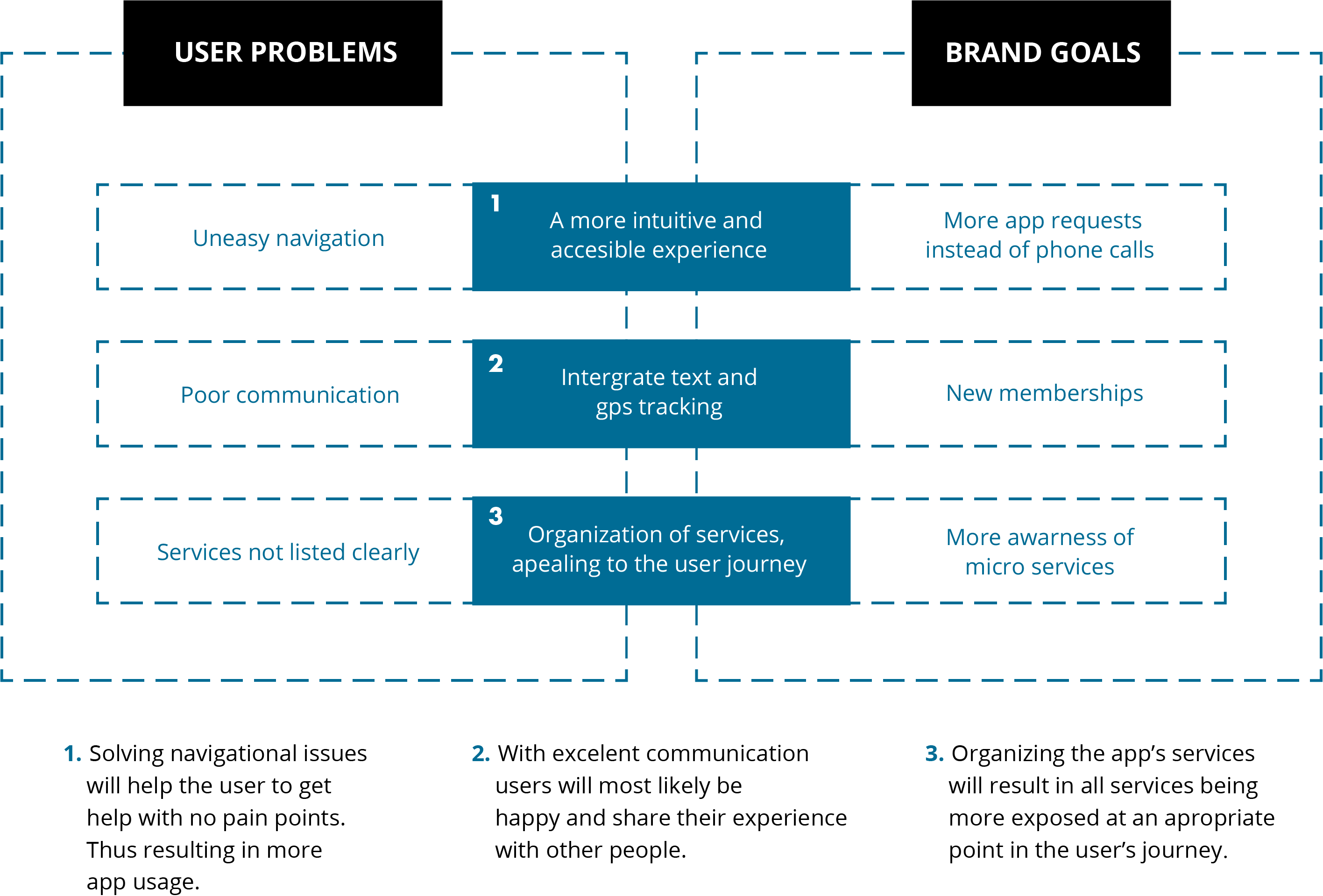
Business problem
With uneasy navigation and poor communication, app usage and awareness of the business is low.
User problem
Navigating AAA's app is a visually exhausting experience and lacks communication.
Discovery
Discovery methods I relied on included interviews, a thorough audit of the app itself, competitor research, and user personas.
-
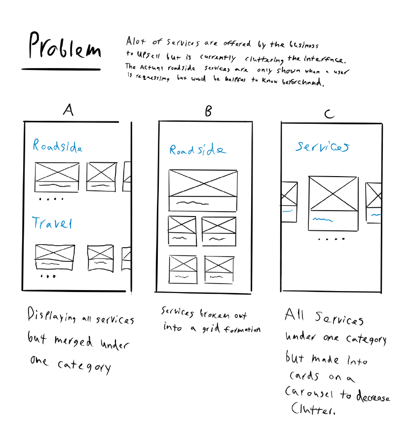
Cluttered interface - The layout of the app interface itself is cluttered and poorly organized. -
Poor discoverability - Confusing UI choices hinder discoverability for important basic actions like knowing what AAA offers, and getting help or reporting an issue to the user's dispatcher. -
Direct messaging - Instead of relying only on the phone call a user gets once the dispatcher is within a certain mileage, we could allow the user to direct message the driver. This can can close the gap on communication issues. Through competitive research, no companies have a feature like that. -
Location detection - Users find uncertainty when they are not able to get a reliable estimated time of arrival. Through competitive research, no companies have a feature like that.
An audit of the pre-existing app
02
Gain Confidence
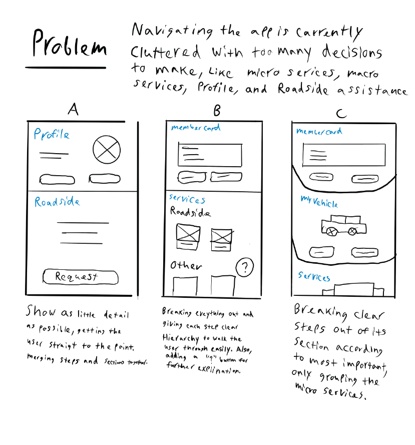
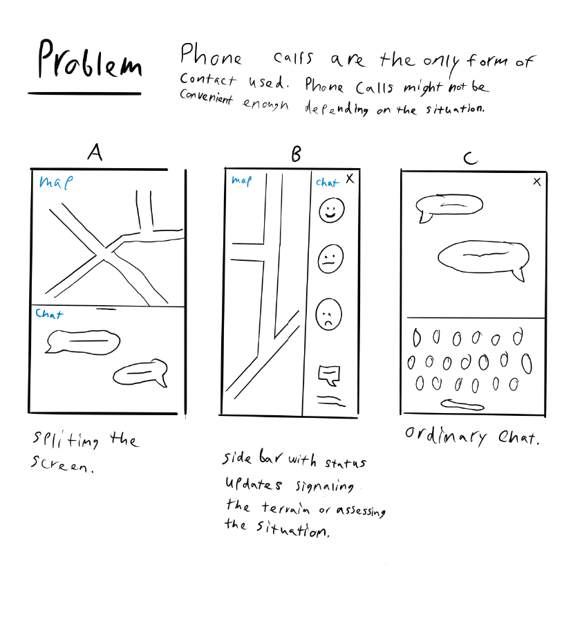
Ideation
I sketched ideas for the the 3 major areas that would be a problem or useful for users, particularly for the persona of Travis and Chrissy. After brainstorming and sketching, I eliminated ideas that seemed impractical or out of scope.
Validate + Iterate
The ideas from my brainstorm and sketching fell into 5 broad directions. From there, I narrowed down to 3 most interesting, all of which focused on the native app:
-
Hand holding - One approach was heavier with hand-holding, giving focus and highlighting to each section. -
Merged sections - Another direction combined steps and sections together for a faster run through. -
Hybrid - A third approach was a hybrid of the other two.
We eventually settled on the Hybrid approach, which allowed for a helpful yet organized interface, using cards as a device to not only highlight sections but also grouping sections with a carousel for AAA's micro services.
I did some basic usability testing on it with people and they found it quite easy to understand.
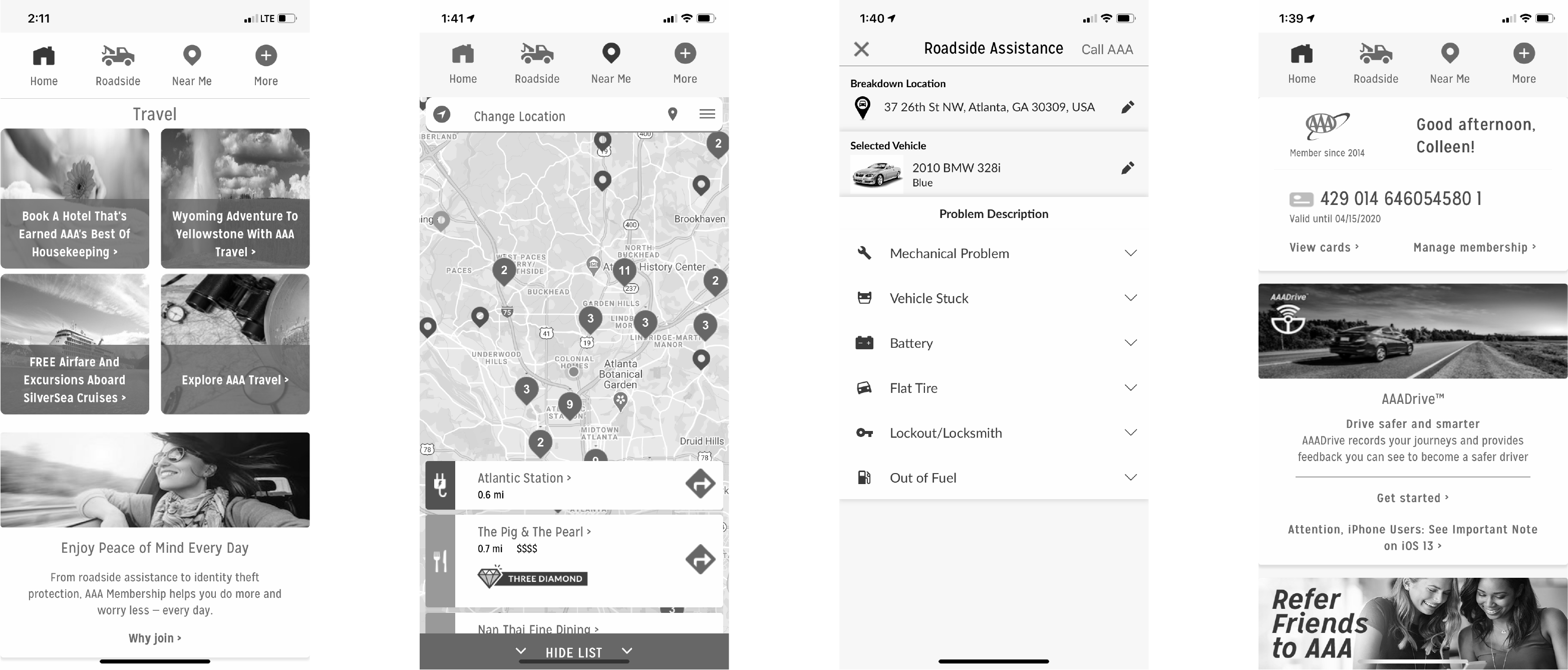
Home dashboard
Services
Chat feature
03
Polish
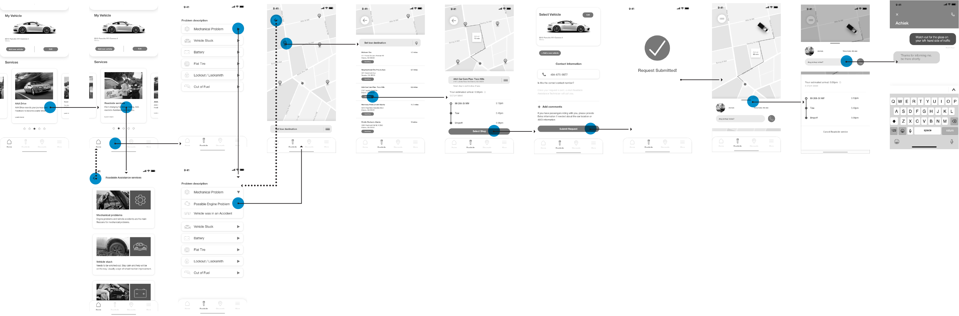
Finished Designs
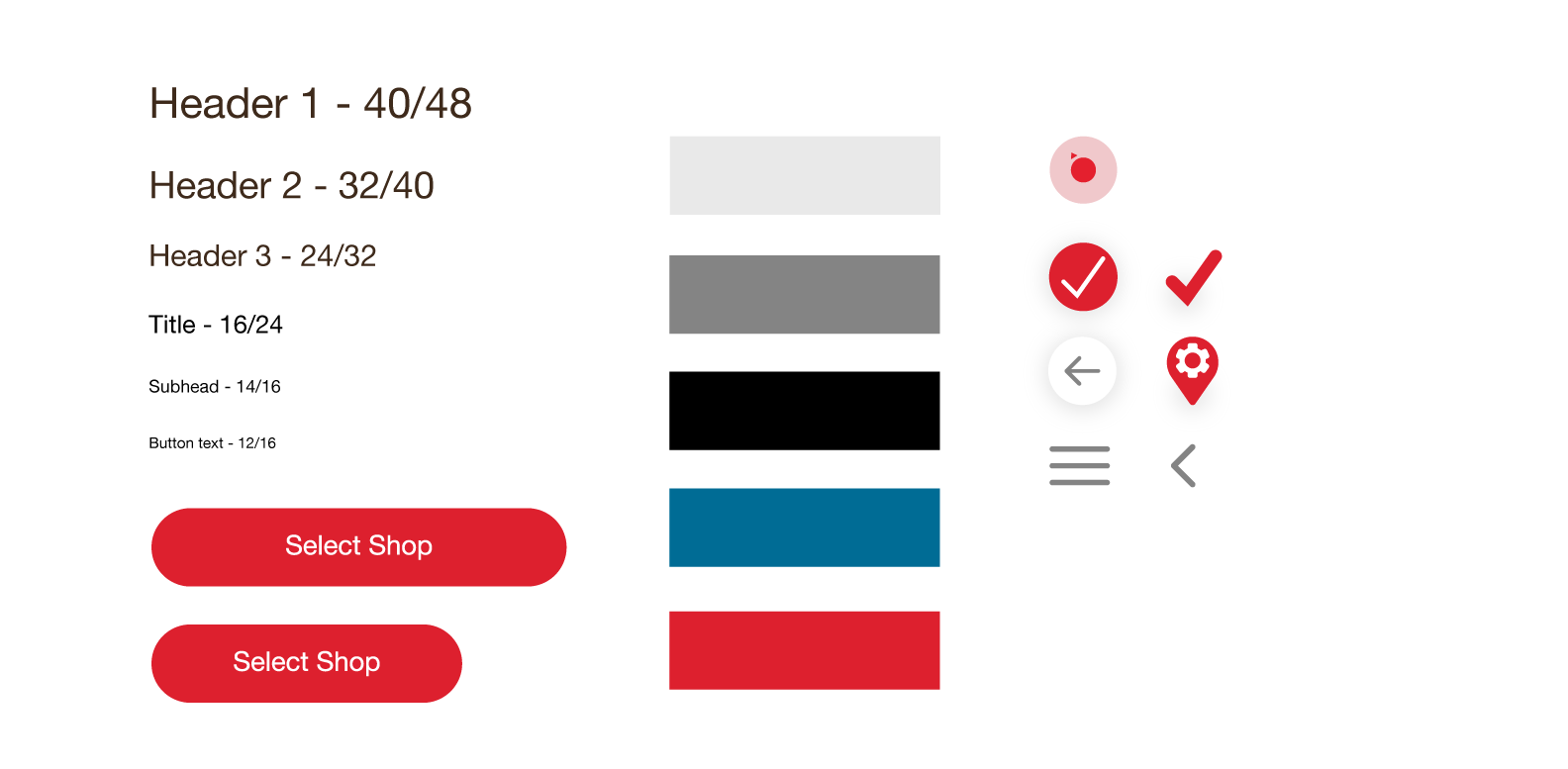
Next, I moved on to UI Design. AAA brand colors consist of an apple-red color, so I used this as a primary call to action color for the app.
Maps are an inherently noisy surface, so I tried to minimize the visual noise in other areas of the interface, including the maps. This meant using white surfaces, clean, flat buttons, simple icons, and a minimal type-scale. Blue is used to highlight and brake up content, while red appears when an important action is about to occur.
Navigation
When opening the app, you are confronted with waves of micro services/info, cluttering the page. We
introduced a new home design that has hierarchy and organization by grouping information into a
carousel. The user now can quickly find their way around without
being overwhelmed.
Main services
AAA's Roadside services can now be found in two locations, instead of after submitting your request. Now users can have a better understanding of the services and are more likely to use the app.
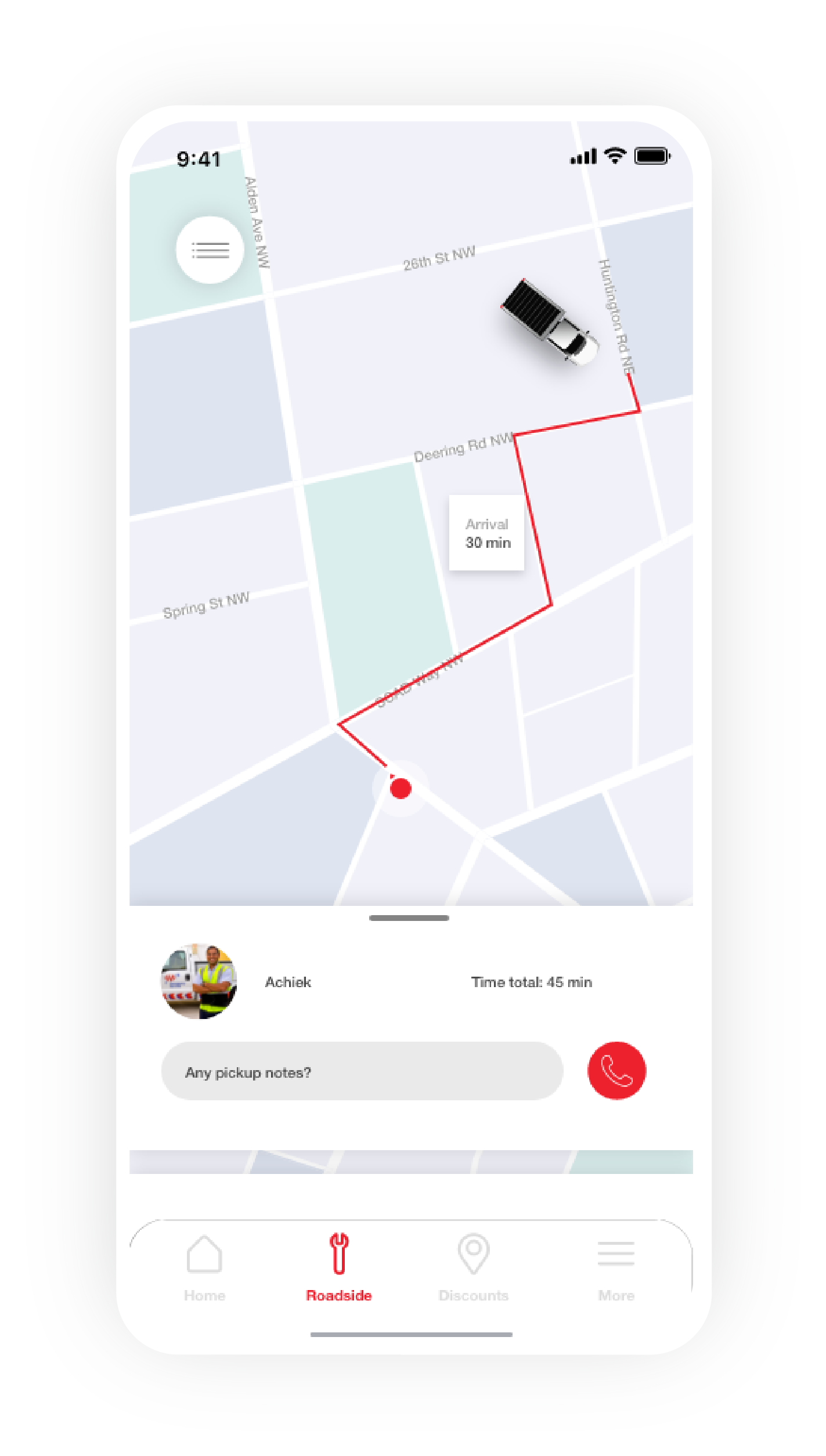
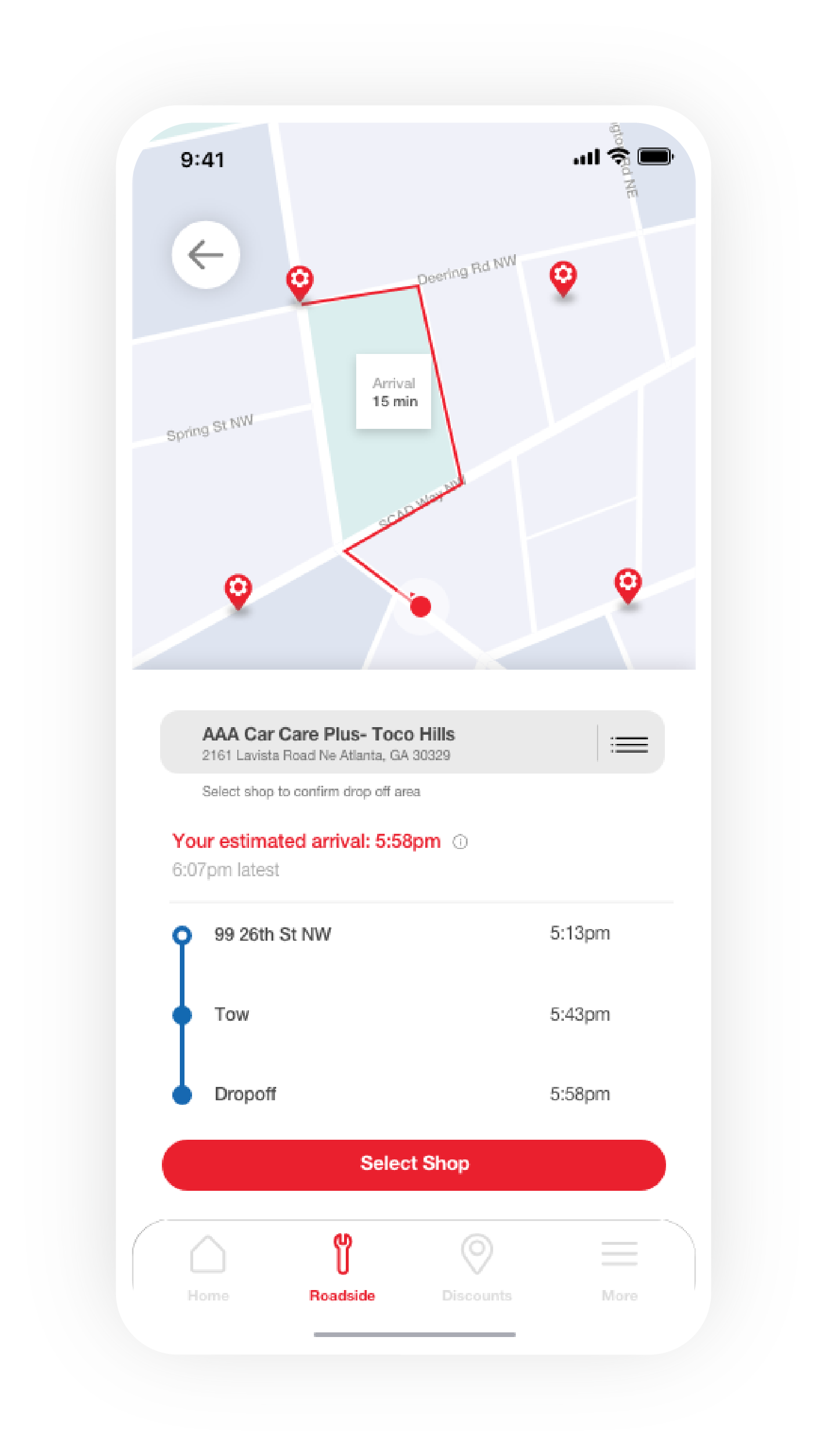
Gps tracking and time
After submitting your request, users can now monitor the time and location of the help unit. This will reduce the anxiety one may feel while waiting with no updates.
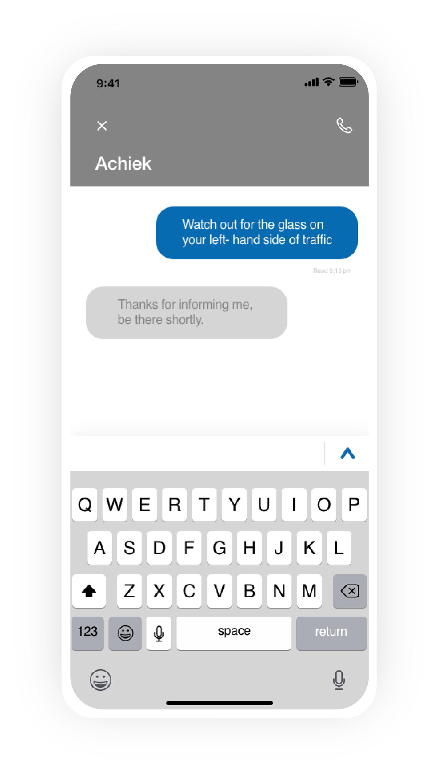
Chat feature
Now with the chat feature added, users can communicate more quickly and effectively.
04
Conclusion
Results
Any of the following outcomes would suggest that the design is successful:
-
More people are able to
navigate the app with ease -
More people find
peace of mind knowing the exact ETA of the dispatcher -
Communication is easier when
sending updates via the chat feature -
More people are
aware of the services AAA offers
Reflection
This UX project was focused primarily on research. I worked with my partner to help facilitate the research and studies. The partnership gave me a healthy responsibility for gathering information and documenting it. This project taught me how agile UX can be, as we had iterations and research to look over constantly.